
How to Use BluelightAI Cobalt with Tabular Data
BluelightAI Cobalt is built to quickly give you deep insights into complex data. You may have seen examples where Cobalt quickly reveals something hidden in text or image data, leveraging the power of neural embedding models. But what about tabular data, the often-underappreciated workhorse of machine learning and data science tasks? Can Cobalt bring the power of TDA to understanding structured tabular datasets?
Yes! Using tabular data in Cobalt is easy and straightforward. We’ll show how to do this with a quick exploration of a simple tabular dataset from the UCI repository. This dataset consists of physiochemical data on around 6500 samples of different wines, together with quality ratings and a tag for whether the wine is red or white.
You can follow along on Google Colab or by downloading the notebook and running locally.
The first step is simple: just load the data (from a Pandas DataFrame) into a CobaltDataset:
Cobalt will automatically deduce the data schema and make appropriate choices about how to display different columns in the dataset.
Now, in order to build a TDA representation of the data, Cobalt needs an embedding. The name is inspired by the unstructured data embeddings created by models like CLIP, but all it means to Cobalt is a representation of each data point in your dataset as a vector. Cobalt uses these vector representations together with a distance metric to determine how similar data points are to each other. In the output TDA graph, more similar data points will be linked together by edges.
The key fact here is that this tabular data is already a vector representation! Numerical features combine together to form vectors. (If you have categorical features, they are easily processed into numerical representations, e.g. with one-hot encoding.) We’re interested in understanding the numerical measurements for these wines, so we will use the numerical columns of this tabular dataset directly. We just need to extract these into a NumPy array and add them to the CobaltDataset.
Then we can create a Workspace and begin our TDA analysis with Cobalt. We’ll build a graph using the embedding we just added to the dataset, and then find clusters of data points inside that graph. Finally, we’ll open the UI to explore the graph.
When we look at the graph, it looks like there is one major axis of variation in the data, and it seems to separate red from white wines reasonably well, although there appears to still be some mixing.

We can explore the different features to see what is going on. For most of the features, there isn’t any clear pattern:
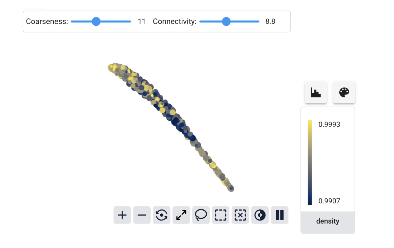
But for total_sulfur_dioxide, we have a beautiful gradient along the graph:
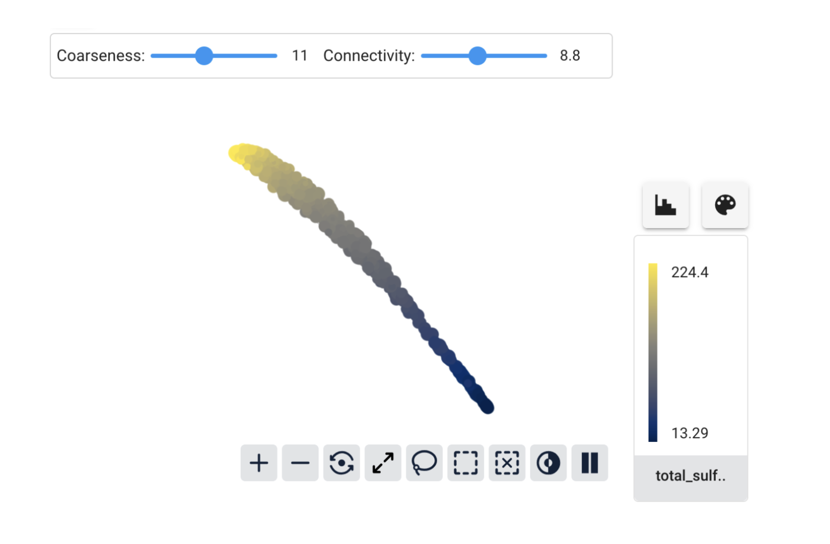
We can see a hint of what’s happening by looking at the maximum and minimum values for the coloring. For density they were very close together, but for total_sulfur_dioxide there is a much wider range. Cobalt uses the Euclidean distance to compare embedding vectors by default, so this difference in range means that features like total_sulfur_dioxide have a much bigger influence on the similarity than features like density do.
Sometimes we want this to happen. But usually, we want each feature to have a similar impact on how Cobalt measures similarity of data points. The easiest way to fix this is by rescaling the data before giving it to Cobalt as an embedding. Here we’ll use scikit-learn’s StandardScaler to make each feature have mean 0 and standard deviation 1.
Now the graph has a much clearer structure separating white from red wines.
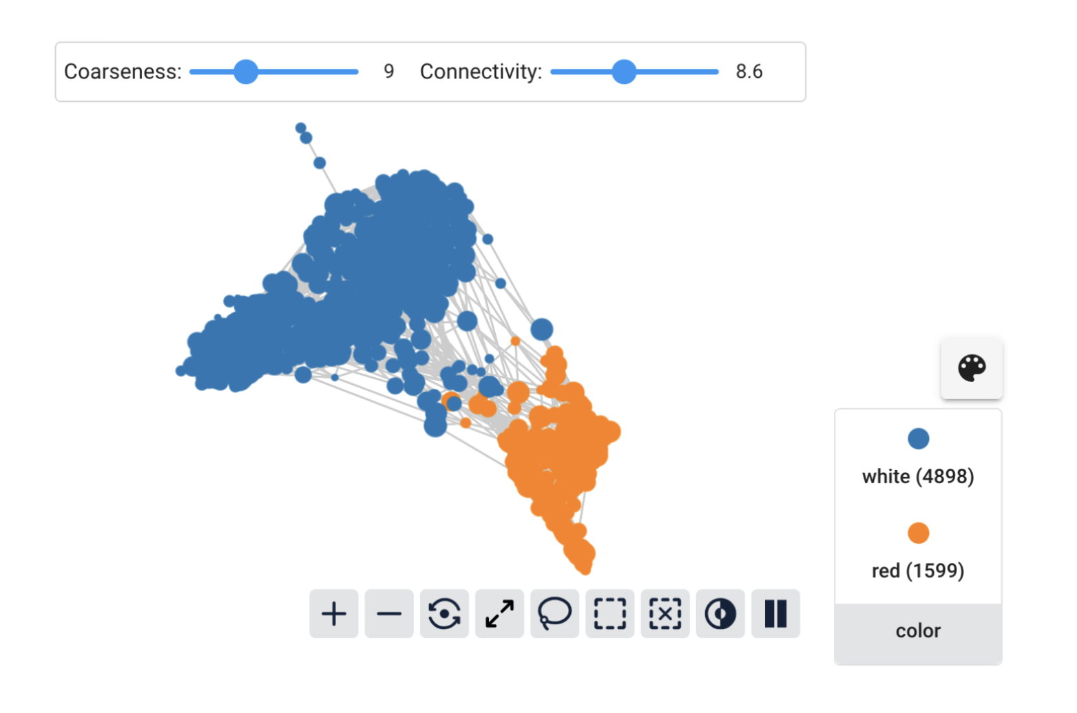
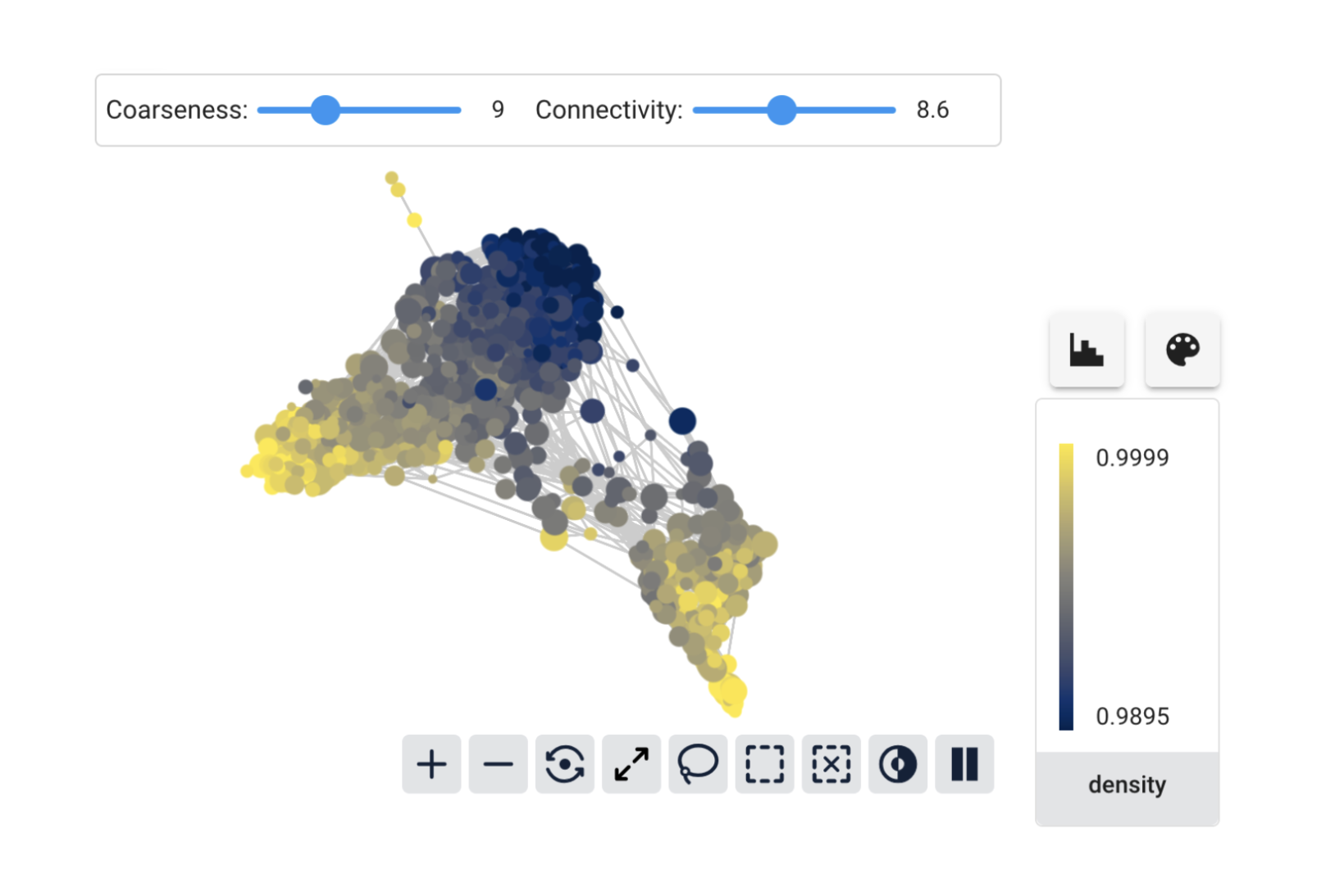
The total_sulfur_dioxide feature still seems to vary significantly between the groups, but there is also interesting within-group variation to explore.

And now features like density also show meaningful variation on the graph. It seems that white wines may be separated into different groups according to density.
This illustrates the most important thing about preparing tabular data for Cobalt: think about the scaling! A good starting point is to standardize each feature, but don’t be afraid to experiment. Cobalt makes it easy to add different embeddings and compare graphs constructed from each.
There’s much more to see from this dataset and BluelightAI Cobalt. Check out the notebook or our examples repository to see more. You can always get in touch with us at hello@bluelightai.com if you have questions or want help getting started with Cobalt.